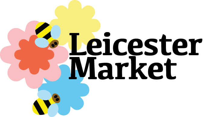
Leicester Market
Leicester Market
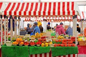
For this module, we were asked to research Leicester City and choose a neighbourhood to rebrand. I chose Leicester Market because of its rich history, central location, and the vibrant mix of cultures that shape it. The challenge was to rebrand the same place twice, each time with a completely different concept and visual direction.
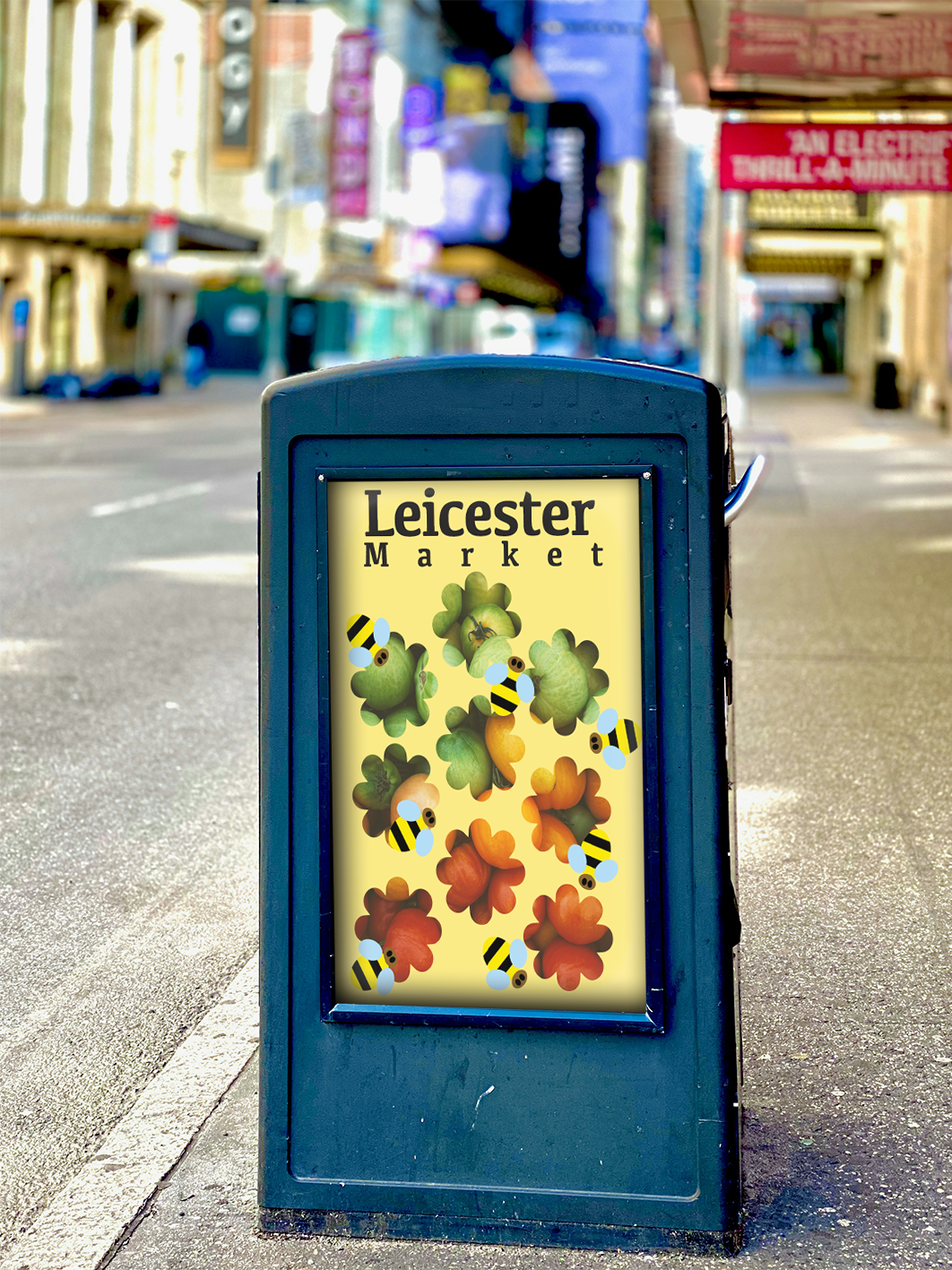
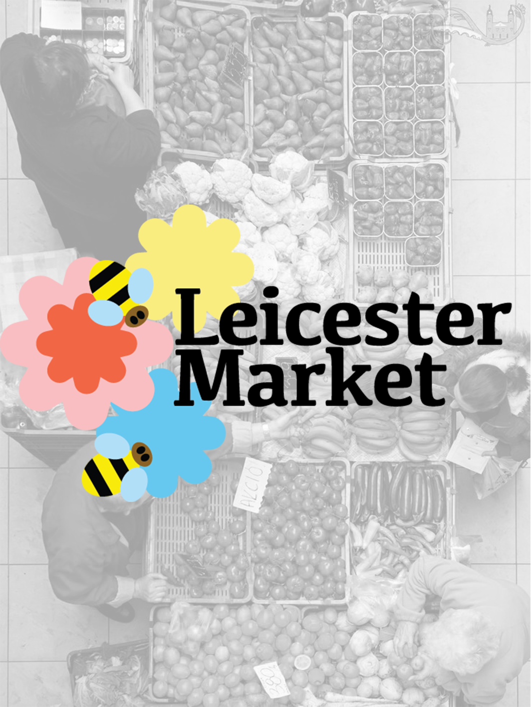
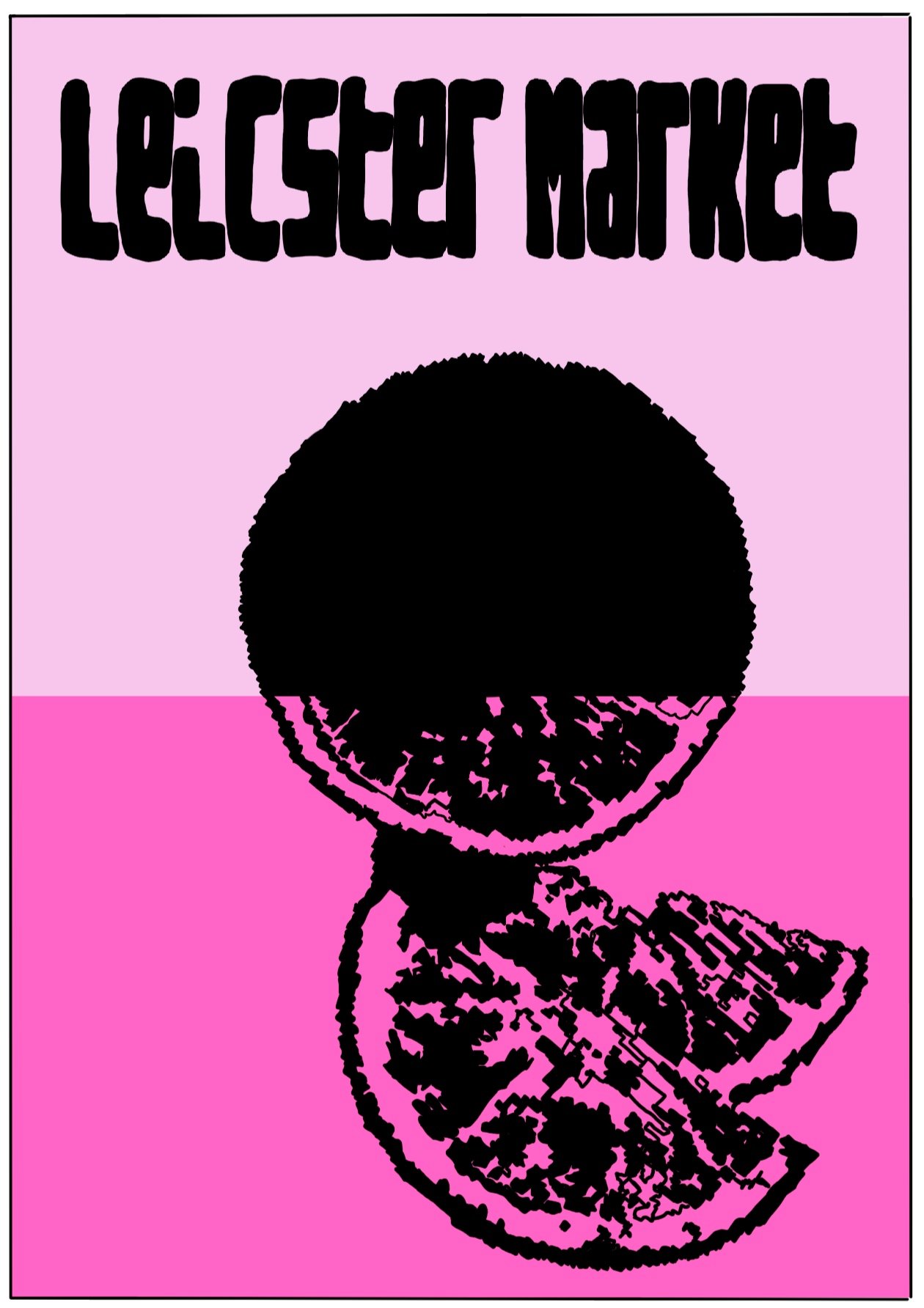
For the first concept, I focused on heritage—celebrating the market’s deep roots in Leicester’s history. I used earthy tones, traditional typefaces, and archival textures to create a nostalgic identity that honoured its legacy and long-standing community ties. The second concept took a completely different turn: I imagined the market as a bold, future-facing hub for young creatives. This version used bright, playful colours, modular shapes, and contemporary typography to present it as a dynamic space for pop-ups, street food, and live events.
The project taught me how flexible place branding can be—and how design can shift public perception depending on the story you choose to tell. It pushed me to think critically about audience, context, and visual language, all while exploring the unique character of Leicester.
Concept One.
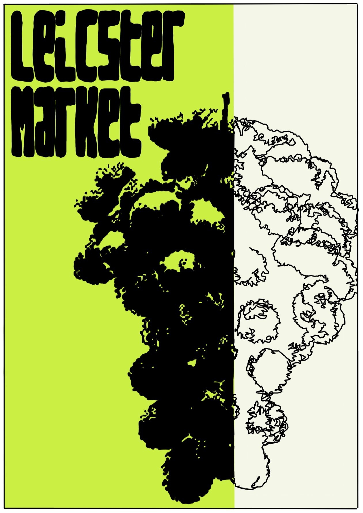

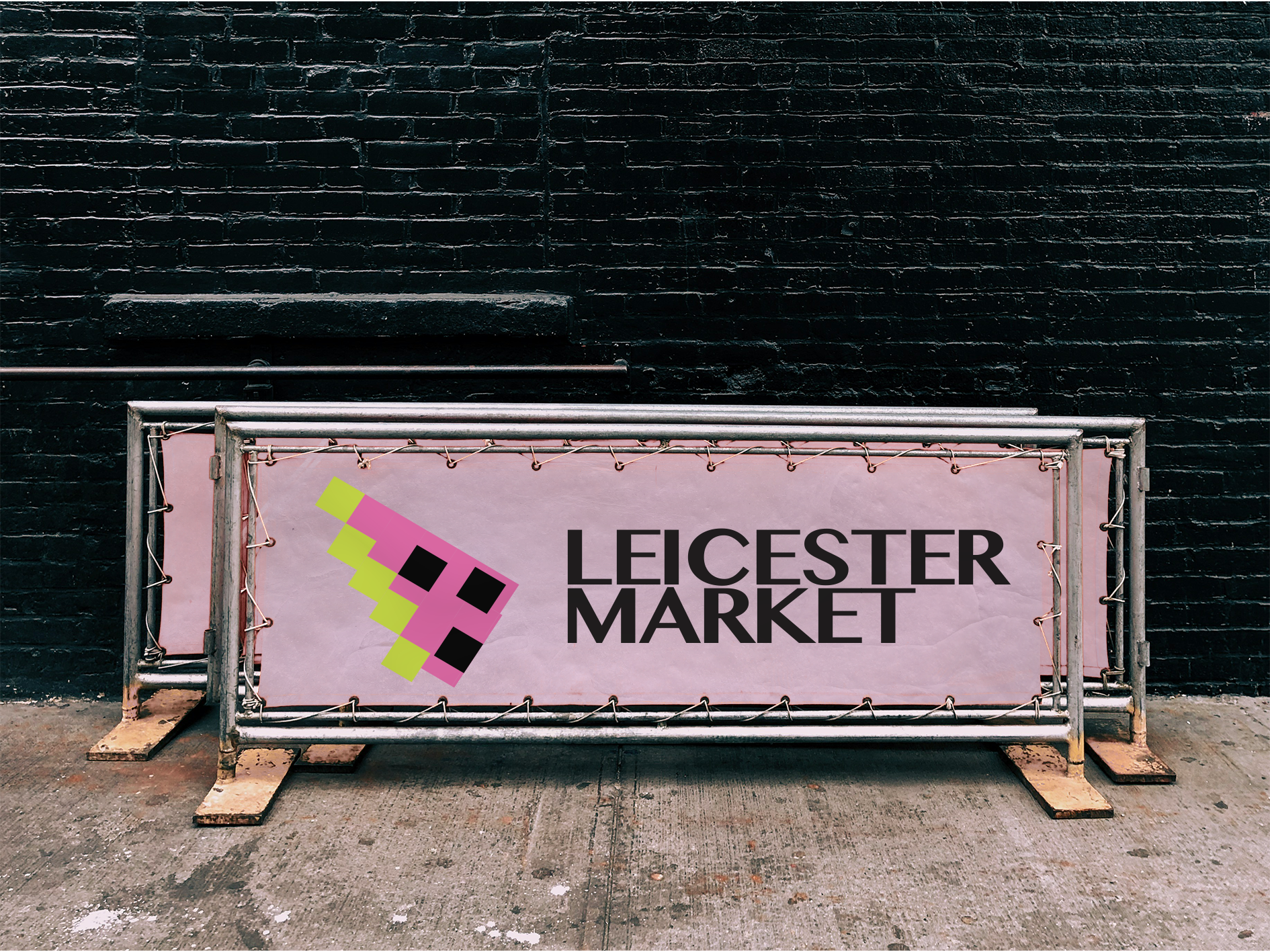
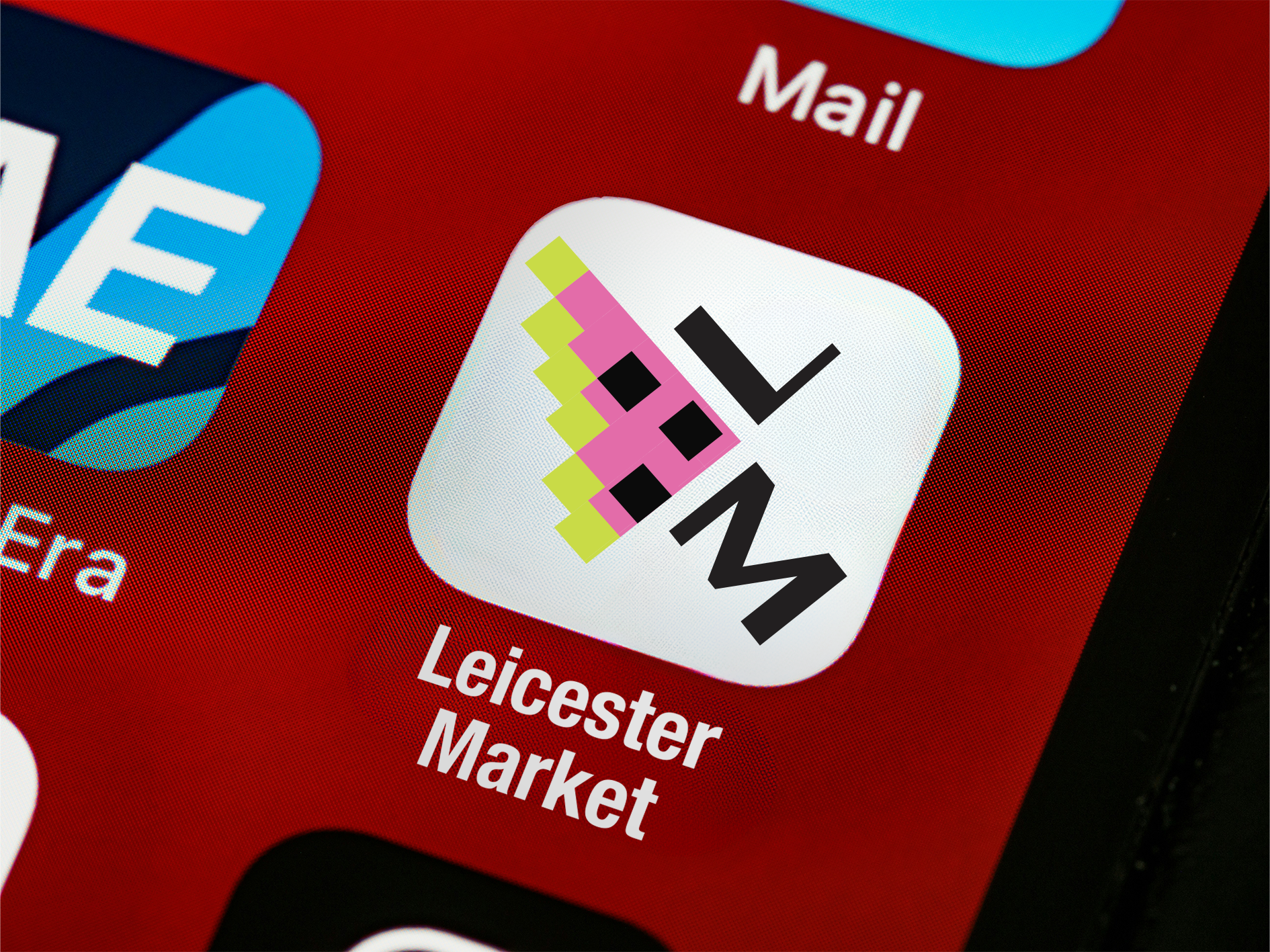
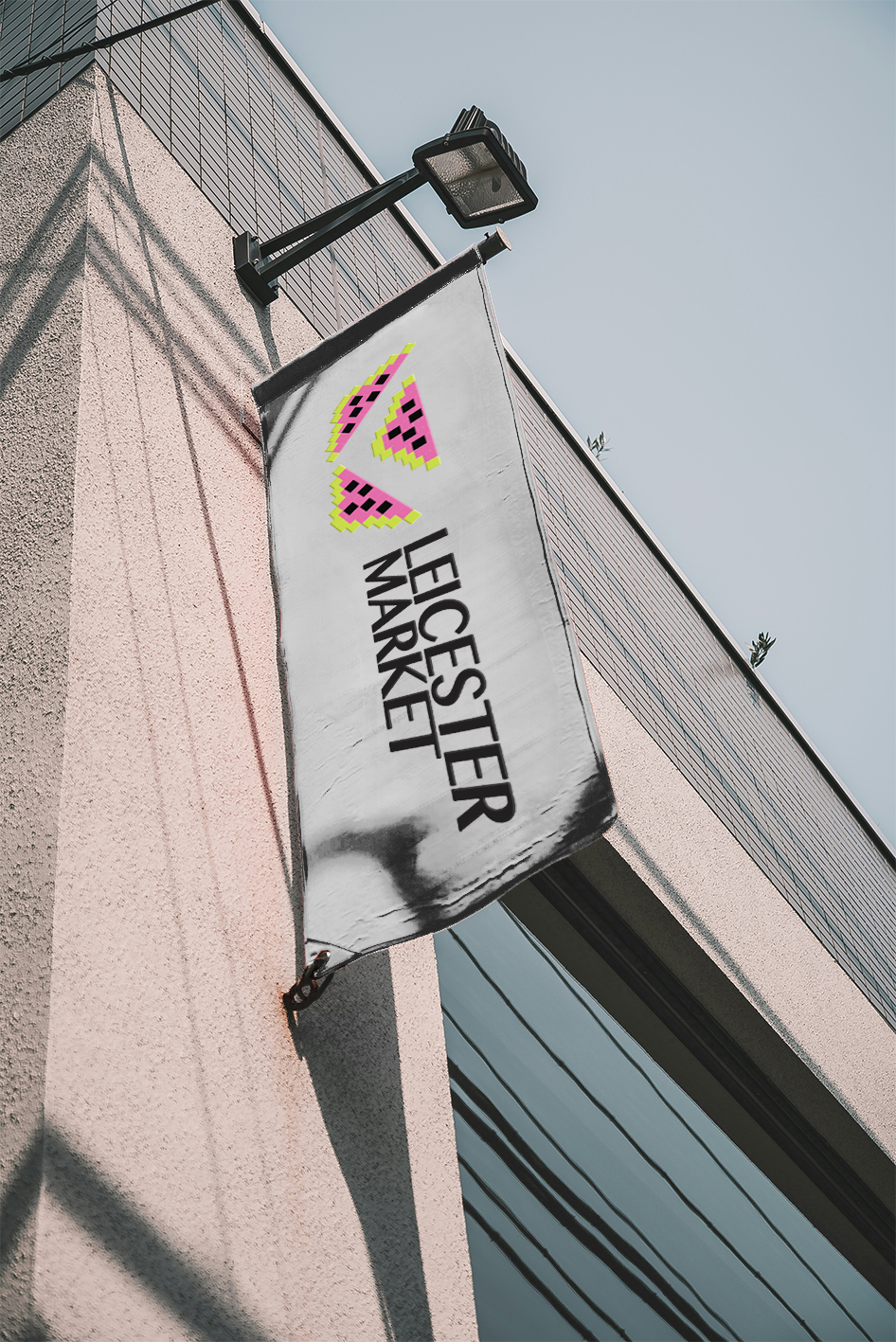


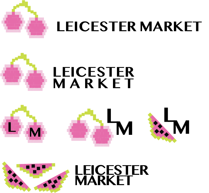
Concept Two.